Author Topic: <Untitled IAQ Project> Aesthetics musings  (Read 7688 times)

DjinnAndTonic

  • Genie and Potion with Alcoholic Undertones
  • DL
  • Denizen
  • *
  • Posts: 6938
  • "When you wish upon a bar~"
    • View Profile
    • RPGDL Wiki
<Untitled IAQ Project> Aesthetics musings
« on: January 21, 2010, 07:57:01 AM »
With some time at work, I threw together some basic sketches of how I was thinking of doing character designs. I tried to keep in mind that we might eventually be making some kind of sprites of these people.

Designs are anime-style, cause that's just how I roll. I'm trying for a slightly modern look, with only a touch of fantasy.

Took some of Excal's advice in setting a unifying theme with uniforms for the Imperials. Noemi is an Imperial, but a student, so her outfit resembles a school uniform (on a whim). Isolde is pictured in her Imperial uniform, though ideally her regular outfit wouldn't be a soldier uniform. But I wanted it for reference.

I made a few stylistic choices that don't really impact much of anything, but since they're here, I should mention them. I decided that the unifying theme were the long stripes down the sides of the uniforms. I think they are blue, so I shaded them darker than the otherwise white uniform. Should stand out and scream 'I am an Imperial!'

Along the same lines, I decided on an emblem of sorts that's easily repeatable. On Isolde's shoulders, you should be able to see a section that's cut out, with another piece of cloth sewed underneath bearing two blue horizontal stripes (Alternately, you could say that the Empire forces its soldiers to tattoo it to their arms if we're feeling extreme). I think of this as the Imperial Flag/Emblem, and I would imagine that all soldiers are required to have the patch visible at all times while on duty (or perhaps ALL the time).

I'm not sure if this applies to Guardians, so I haven't made a Mirek design yet.

Isolde is wearing a bit of Leather Armor over her chest and forearms. I imagine that some troops wear heavier stuff, but since we live in a world with magic, I imagine something light, but magically-fortified is more helpful than clunky armor.

Also, I hate drawing heavy armor.


Fucking around first sketch.


Student Uniform sketch. Note the clever use of hatch to mean 'blue'


Noemi! Weird hand position. Originally I was going to have her presenting some sort of report and her hand was on the table. I changed my mind and decided I wanted to do a full-body shot instead.


Isolde. Pretty much how I imagined her. Halberd is negotiable. I imagine she could fit quite a few more sheathed blades on that outfit. The boots are possibly laced up the sides, I couldn't decide if that was better than just making them part of the 'stripe' theme. Depends on how kinky we want her to look, I suppose.

Anyway, I'm probably the only one who cares about aesthetics anyway, but that's what I have so far.

Excal

  • Chibi Terror That Flaps in the Night
  • DL
  • Denizen
  • *
  • Posts: 2603
  • Let's Get Adorable
    • View Profile
Re: <Untitled IAQ Project> Aesthetics musings
« Reply #1 on: January 21, 2010, 08:43:33 AM »
Hmm, that uniform doesn't look too off from what I was figuring.  Though the tightness of that mini-dress thing looks like it'd be hard to move around in.  As for Noemi, I can understand her personal style involving a bared belly.  But an official uniform?

Looks pretty good otherwise.

DjinnAndTonic

  • Genie and Potion with Alcoholic Undertones
  • DL
  • Denizen
  • *
  • Posts: 6938
  • "When you wish upon a bar~"
    • View Profile
    • RPGDL Wiki
Re: <Untitled IAQ Project> Aesthetics musings
« Reply #2 on: January 21, 2010, 09:33:21 AM »
She altered her uniform to her personal tastes. The official school uniform would be a full shirt, obviously.

Dark Holy Elf

  • Moderator
  • Denizen
  • *
  • Posts: 8134
  • Well-behaved women seldom make history
    • View Profile
Re: <Untitled IAQ Project> Aesthetics musings
« Reply #3 on: January 24, 2010, 07:33:03 AM »
First of all, yay Djinn! Really happy you're doing artwork for this. As someone who's poked around in RPG design a fair bit myself, art has always been one of those things that gets filed under "well it'd be nice, but I/we can't do it, so yeah, oh well". Art, even sketches, bring the characters to life more and give us all a better conception of the characters, I think.

Also, I do totally care about aesthetics, even if not many people seem to, so...

Nitpicks: I am mildly opposed to Noemi's outfit being modelled after a schoolgirl. She's in grad school (or something similar), not high school. Nothing stops you from assigning that style of dress to an older age range in the Empire but I still instinctively doesn't like it much.

Not sure about the midriff exposure either. I think you need to ask yourself what kind of message she is sending by choosing to dress that way. Depending on the character it might be reasonable; it can be taken as a sign that she is comfortable with her appearance and sexuality, is proud of her looks and enjoys showing off a little, or whatever, I dunno. You also need to consider how people around her are going to take this. Is this normal? Is it normal for an academic who wants her work to be taken seriously? I'm not outright opposed if the answer is "yes" but this is something that needs to be thought about. It's not really in line with the stereotypes of a controlling empire (not that I object to stereotype breaking). Idly, if the design holds up, I suggest that if we do go with that we should have the barbarians adopt a much more puritanical outlook and comment on her outfit as a bit of a shout out. Sorta like the Lymsleia-Jeane scene in S5 but not as extreme. Annnyway, got on a bit of a tangent there, so to sum up: I'm not outright opposed to a somewhat revealing outfit but it should be consistent with both the character and the world. Also others should weigh in on this. I would rather avoid needless fanservice but I'm also not a prude about character design; some people like to show off a little.

But again, I like the general style and definitely appreciate it; keep up the good work! Hope to see more soon~

Erwin Schrödinger will kill you like a cat in a box.
Maybe.

AndrewRogue

  • Infinite
  • DL
  • Denizen
  • *
  • Posts: 3079
  • Sadness
    • View Profile
Re: <Untitled IAQ Project> Aesthetics musings
« Reply #4 on: January 24, 2010, 07:47:11 AM »
No general comments yet, just want Djinn to know I have actually been looking/paying attention >_>

Yoshiken

  • Denizen
  • *
  • Posts: 2068
  • Yay!
    • View Profile
Re: <Untitled IAQ Project> Aesthetics musings
« Reply #5 on: January 24, 2010, 11:19:37 AM »
Just chiming in to agree with Elfboy. The fanservice isn't a big deal, but is it really on the right character here? My initial thought for something like that, even if not the uniform, was Eirwen. I mean, she's running a tavern! She has an excuse for fanservice - getting more customers~

Sir Donald 3.2

  • Wanting some Kingdom conquering
  • Denizen
  • *
  • Posts: 301
    • View Profile
Re: <Untitled IAQ Project> Aesthetics musings
« Reply #6 on: January 24, 2010, 03:51:52 PM »
As a male Grad Student, while I wouldn't be wearing them while working on the job (jeans and a polo shirt as a minimum, and that's for field work, Shirt and Tie for presentations,) I would just like to say that in my personal life:
"I like shorts!  They're delightfully comfy and easy to wear."

Make of that what you will.  (Likely lead to multiple outfits; each for different occasions.  Even a one-piece body suit for underwater operations; just make it classy.)

DjinnAndTonic

  • Genie and Potion with Alcoholic Undertones
  • DL
  • Denizen
  • *
  • Posts: 6938
  • "When you wish upon a bar~"
    • View Profile
    • RPGDL Wiki
Re: <Untitled IAQ Project> Aesthetics musings
« Reply #7 on: January 24, 2010, 11:23:58 PM »
Yeah, I'm calling executive priviledge then.

These nations are all spread out on islands, so I'm gonna go ahead and say that the climate is normally quite warm. So it's a matter of course to show skin, even in official attire. I know we do that in Florida. People don't wear business suits in summer. It's suicidal.

So... what I'm trying to say is that -everyone- will wear slightly-less-than an average amount of clothing.

See the difference? If -one- person is half-naked, it's fanservice. If -everyone- is half-naked, it's world-building.

Since I'm drawing these jokers, I'm thinking this will have to do. So everyone think 'tropical'.

Dark Holy Elf

  • Moderator
  • Denizen
  • *
  • Posts: 8134
  • Well-behaved women seldom make history
    • View Profile
Re: <Untitled IAQ Project> Aesthetics musings
« Reply #8 on: January 24, 2010, 11:28:31 PM »
Yeah, that's a fair reason, and one I didn't even think of! Yay geographic bias.

Would anyone object if the the God Kings were from a more temperate climate, as part of the contrast between God Kings and empire? So... either north or south, doesn't matter. I'll leave that decision to the conceptions of geography that Andy et al. have been forming.

Erwin Schrödinger will kill you like a cat in a box.
Maybe.

DjinnAndTonic

  • Genie and Potion with Alcoholic Undertones
  • DL
  • Denizen
  • *
  • Posts: 6938
  • "When you wish upon a bar~"
    • View Profile
    • RPGDL Wiki
Re: <Untitled IAQ Project> Aesthetics musings
« Reply #9 on: January 25, 2010, 02:30:05 AM »
It would be an interesting contrast if the God Kings were a little more conservative of dress, but a bit more liberal in thought. Being from a temperate climate is also easy to adjust for since I haven't designed any God King Tribe members yet.

I still want to make one of them a bare-chested Conan-looking clone though for the amusing 'Barbarian' stereotype we were discussing earlier. He can be 'the weird one'. Or maybe the bare-chested thing is part of spiritual training since they live in a cooler climate? *shrugs* It's just a whim. Until I actually draw it, it's mutable.

No time to draw ATM, but we'll see. And I really should do Mirek and Erastus next. If Andy or anyone has any thoughts/suggestions, now is the time to give them.

Dhyerwolf

  • Mod Board Access
  • Denizen
  • *
  • Posts: 4736
  • Here it comes, the story, of mankind's final glory
    • View Profile
Re: <Untitled IAQ Project> Aesthetics musings
« Reply #10 on: January 25, 2010, 06:47:54 AM »
Skin tight long sleeve tops aren't very tropical.
...into the nightfall.

AndrewRogue

  • Infinite
  • DL
  • Denizen
  • *
  • Posts: 3079
  • Sadness
    • View Profile
Re: <Untitled IAQ Project> Aesthetics musings
« Reply #11 on: January 25, 2010, 07:44:37 AM »
Mirek: Initially, he should look pretty sloppy/unkempt. Long hair, roughly shaven, a bit dirty... he should look like he's been living the low life for the last year or so. Look to drunks/the homeless for inspiration. Dark hair, dark eyes. His expression and stance always seem placid and lazy, but there is a fire burning deep in his eyes. He should wear whatever remenants of his Guardian clothing remain (thinking along the lines of a cloak) as a defiant badge of pride for what he once was. As the game progresses and his interactions with the PCs and Ei increase, his look should clean up and really reflect that the guy was once the son of a wealthy and important individual. He should wield a katana-esque blade, since his combat style is really similar to Iaijutsu, and I dunno a better weapon that really does it.

Erastus: Should look pretty old, the ravages of time and stress having made a mess of him. His form is pretty thin and gaunt. White hair, starting to get thin, but still enough for him to wear it freely. He is defintiely a snappy dresser and keeps up with current styles. Despite his frail appearance, he is perfectly capable and mobile, but he loves playing the role of frail, helpless old man for kicks. He'll often adopt a hunched form, faded voice when addressing strangers... only to suddenly stand up straight and address them normally in the middle of the conversation. His lips almost always curve into something of a smile that almost seems out of place on his weathered, tired countenancce.

Dark Holy Elf

  • Moderator
  • Denizen
  • *
  • Posts: 8134
  • Well-behaved women seldom make history
    • View Profile
Re: <Untitled IAQ Project> Aesthetics musings
« Reply #12 on: January 25, 2010, 07:46:41 AM »
Oh, I definitely have the barbarian leader pictured as bare-chested. But yeah, that's for eccentric reasons.

Erwin Schrödinger will kill you like a cat in a box.
Maybe.

DjinnAndTonic

  • Genie and Potion with Alcoholic Undertones
  • DL
  • Denizen
  • *
  • Posts: 6938
  • "When you wish upon a bar~"
    • View Profile
    • RPGDL Wiki
Re: <Untitled IAQ Project> Aesthetics musings
« Reply #13 on: January 28, 2010, 10:04:03 AM »
Evolution happening!

Noemi: Mixed up Noemi's design for something more fantasy-ish, and lost the pleated skirt and ribbons. Added a circlet, but it makes her look even younger than before, so I'm dropping that. Kept the twintails because they're distinct should I need to make a sprite of her. It also would fit her field work, being quick-to-put-up and out-of-her-way while working. Her sash may eventually change into something more useful like a sheathed weapon, but for now she is Hitchhiker's Guide-approved for travelling - she'll never go anywhere without a towel. The look is primarily supposed to invoke a 'sexy archeologist' theme. Whatever that means.


Mirek: Meant to resemble Noemi's new look a bit. His uniform top is a half-shirt because it's hot in the Empire. Still sporting the stripes, too. The jacket thing is actually supposed to be reinforced to work as light armor. His fighting style is based on landing a few, precise quick iaijutsu hits, so he needed to be mobile. He's built sturdy, but not musclebound. When the Guardians were formed, they started their own little 'troop culture' to distinguish themselves from the standing military - every Guardian sports a warrior braid that they've continued to grow since their initiation into the Guardians. So... the length the braid should indicate how long a Guardian has been in service. The rebel Guardians would be especially proud of these braids since it's not something the Empire decreed (unlike the double-stripe tattoos that all soldiers are forced to get).

I'm not entirely sure about this design, despite all the thinking I've put into it.


Eirwen: First look! I'm really happy with the design, but I'm not sure if it suits Eirwen. My initial theme was 'bar maiden', but Andy got me thinking 'she's more of a cook', so this could change. The hair is really bland, but the outfit is eye-popping enough that I'm okay with the tradeoff. Really like the kimono/corset combo. For actual cooking, I imagine the sleeves can be rolled up okonomiyaki-seller-style. She's the least practical design I have so far, but I think she's the only character that it suits so far.


Erastus: Oh, I love this design. I kept thinking 'Erastus is supposed to be likable'. It turns out that translated as 'base him off of a super-hero' in my mind's eye. I'm so happy with how it turned out. He's just a super-jolly-looking guy. And he's got just enough meat on his bones that it looks like he could actually withstand some adventuring.


Fear the Beard.

Yoshiken

  • Denizen
  • *
  • Posts: 2068
  • Yay!
    • View Profile
Re: <Untitled IAQ Project> Aesthetics musings
« Reply #14 on: January 28, 2010, 10:38:02 AM »
I have to say, Eirwen and Erastus are pretty much exactly as I'd imagined them. Awesome work. :)

AndrewRogue

  • Infinite
  • DL
  • Denizen
  • *
  • Posts: 3079
  • Sadness
    • View Profile
Re: <Untitled IAQ Project> Aesthetics musings
« Reply #15 on: January 28, 2010, 06:48:31 PM »
Erastus design looks fine. I'd say more, but, alas, mine coffee break doth end.

DjinnAndTonic

  • Genie and Potion with Alcoholic Undertones
  • DL
  • Denizen
  • *
  • Posts: 6938
  • "When you wish upon a bar~"
    • View Profile
    • RPGDL Wiki
Re: <Untitled IAQ Project> Aesthetics musings
« Reply #16 on: February 17, 2010, 10:45:38 AM »
Trying out a new Noemi design idea. I'm happy enough with the outfit, so I'm recycling the old design to use as Kasia, since they should have some clothing resemblance anyway. I wanted to try something layered for the new hair design, so her face is a bit less round now due to how the hair frames it. Also, the key point is the Ribbon, taking a cue from WA3's Virginia here.

Getting the idea from my head to paper:


This barely resembles the final result. >.>;;

Infusing the design with Virginia-ness:


Rough, but I felt this image was important to see the transition. Hair got a bit longer, but it gets shorter again as I'm trying to find the right length.

First proper portrait:


Here you can finally see what I was going for. The hair overlaps itself at varying lengths to provide a unique look, without going too overboard with 'anime hair' syndrome spikeyness or impossible physics. The ribbon gets magic runes since I'd been wanting to include these things on various equipment pieces for the entire cast as a unifying element. The idea is "Magic Exists, it makes sense that they'd use it to increase the potency of weapons/armor". I've decided to show this by having random runes on various pieces of equipment. I'll worry about standardizing which runes later. For now, it can also just be seen as some kind of design to make white space less boring.

Design in motion:


Yay, it moves nicely! There's a lot impossible and horrible design choices you can get away with in static portraits. Bust shots and still poses just have so many places where improper designs can trick the eye. A motion shot is much less forgiving. Once you make a character move, you can really see what your design looks like, instead of what you were trying to force the image to look like. Noemi's hair physics aren't entirely accurate to real life, but they're close enough that I put her in motion and she's recognizable and distinct. Success. Clothes later.

First 'Official' Portrait:


Noemi means business here. I intentionally wanted to draw her with a stern look because I'm trying to see her as the mature, driven character that Andy talks about and not the genki, girly archetype I was picturing before. I still think that Noemi should have some genki girly sides to her personality, but I'm trying to focus on the other side first. Additionally, the design is still fairly girly enough that I doubt I'll have much trouble drawing an energetic Noemi in this style.

Shot from the back:


Just a quick sketch. When I was originally envisioning this new design, Noemi's ribbon was tied behind her hair like this. But then you wouldn't be able to see much of her design from the front and that's just bad character design, so the ribbon was tied beneath the length of her hair instead. However, I still really like how it looks from the back. Note that in more 'official' art, you won't be able to see the knot over her hair. The loops of the ribbon and the length of the ribbon could easily peek out from underneath the hair from time to time, but the knot just wouldn't be able to seen without breaking a few laws of physics. Unless it's some kind awesome Heisenberg Ribbon that changes position depending upon what angle you observe it from! ^_^

From here on in, we have what is classified as "Djinn is screwing around on a train". Nothing official, but I was bored on the train with my sketchbook.

Noemi and Kasia, whoring it up!


Was bored, so I skankified them. Also, they seem to be a bit lezzy here, too. Awesome. >.>;;

Isolde: Who needs clothes?


Objectively bad drawing, but it's the second time I've actually tried drawing Isolde, so I figured I'd better post it. Was too lazy to draw clothes, and she needs a clothing redesign anyway. I like how the hair looks in profile at least.

Eirwen and Mirek: "I boop yer nose. *boop*!"


Taishyr showed me an adorable picture and I couldn't get its catchphrase out of my head. So this picture happened. Too lazy to draw clothes, so the picture takes on a much more suggestive tone than I intended... But hey, sex can be cutesy, too! I like drawing Eirwen's hair now that I know that it moves like it's wet all the time. Mirek's hair also got scruffier and slightly more anime-like, but I like it better now too.

AndrewRogue

  • Infinite
  • DL
  • Denizen
  • *
  • Posts: 3079
  • Sadness
    • View Profile
Re: <Untitled IAQ Project> Aesthetics musings
« Reply #17 on: February 21, 2010, 09:16:33 AM »
Overdue.

1. The initial design was a nice starting place. Looks young, but not too young. The hair is nicely organized and the ribbon serves to nicely offset it. Looks just a bit too soft, maybe (a closer look is actually less childish then I thought) but definitely a nice place to launch from.

2. Moving along, not so fond of this rendition. The longer hair doesn't look quite right. It drowns out the effect of the ribbon and just looks... lazy? Sloppy? (Not the art, but the character themselves). Her face also looks a bit too long, as a result.

3. Nice. The addition of the ribbon designs greatly enhances the overall look by adding some much needed detail in the area of the hair. The way the hair lays under the ribbon is much cleaner looking and neat. The face is fantastic, and manages to tread right in the correct region. Could use a tiny bit of sharpening (she looks a little too soft with how rounded all the features are), but honestly, I'd worry about it going too far that way.

4. Not a ton to say here. Hair looks dynamic in movement. Volume is very nice.

5. I don't think I'll ever find a happy line between curves and shar lines. You'll have to decide on one. Seriously though, ranks up there with 3. The seriousness business expression is impressive, though. The ribbon looks great and you made an excellent call on it.

6. Need to see the outfit from the front to really comment. Not sure if I'm sold on the bathing suit/clothing hybrids, but I'll give you a couple characters to convince me that it works as a thematic, overall design aesthetic. I don't really see anything wrong with it (well, the pants kinda bug me, but that's the swimsuit aesthetic, which I might warm to). Not much to comment on the ribbon side. It looks better there with a back view, better where it is in the front view during a front view >_>/

7. Noooo comment.

8. Not much to say, since it is more an arty piece then anything. Hair looks interesting, but I'd need to see it on a more composed picture. No major objections as is, though.

9. Cute. May have sold me on your conception of Ei being on the younger end of the spectrum (younger then Noemi, which likely makes me her at least the youngest girl in the cast, if not the youngest general PC?), as I find myself writing in response to it. The hair is involved and cool. Mirek profile looks like it has potential and I wouldn't mind seeing another go at  it.

Dhyerwolf

  • Mod Board Access
  • Denizen
  • *
  • Posts: 4736
  • Here it comes, the story, of mankind's final glory
    • View Profile
Re: <Untitled IAQ Project> Aesthetics musings
« Reply #18 on: February 22, 2010, 08:35:28 AM »
Noemi and Kasia, whoring it up!

Dhyer stamp of approval. If you are going to make them fanservice, make them actual fanservice!
...into the nightfall.

AndrewRogue

  • Infinite
  • DL
  • Denizen
  • *
  • Posts: 3079
  • Sadness
    • View Profile
Re: <Untitled IAQ Project> Aesthetics musings
« Reply #19 on: March 18, 2010, 06:41:26 AM »
'cause I wasn't good enough. ;_;
« Last Edit: March 18, 2010, 09:11:43 AM by AndrewRogue »

DjinnAndTonic

  • Genie and Potion with Alcoholic Undertones
  • DL
  • Denizen
  • *
  • Posts: 6938
  • "When you wish upon a bar~"
    • View Profile
    • RPGDL Wiki
Re: <Untitled IAQ Project> Aesthetics musings
« Reply #20 on: March 18, 2010, 09:11:06 AM »
Because I'm more of a control freak than I thought, I'm hijacking this post to add artist's notes and resize things to their proper heights.


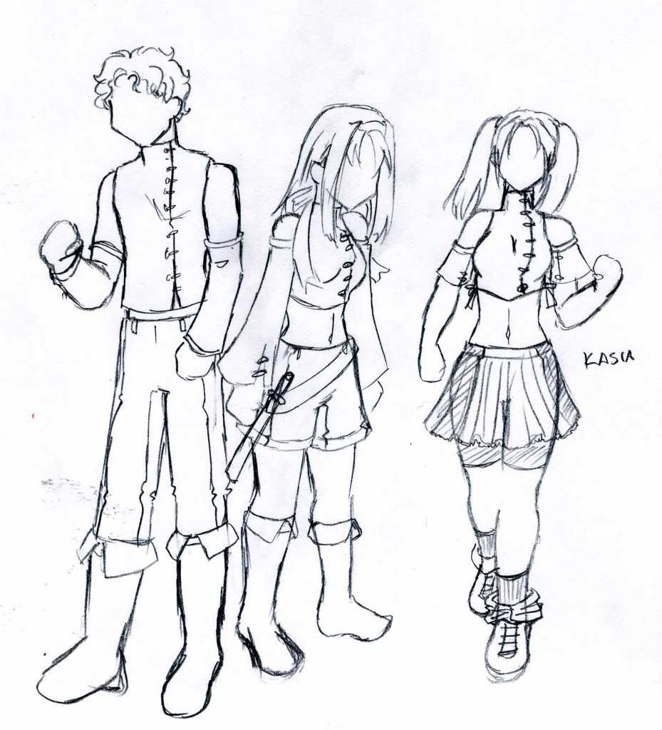
Academy Uniform Rough Designs (Fahim, Kasia and Noemi)
Notes: Because Noemi's the heroine, I of course designed this uniform first, even though the story explanation would make it so that the Military uniform came first and this School Uniform was derived from it (this is a military-owned research academy, after all, though it does offer a degree of autonomy). The key features of the uniform are the exposed arms and various climate-conscious fabric decisions. Exposing the upper arm is important as members of the Imperial Military tattoo the Imperial double-stripe on their shoulders. The students who are entering the military directly after the Academy are already tattooed, and it's a symbol of pride.

The broad vertical stripes down the sides of the uniform are directly part of the Imperial Military Uniform motiff. Even the female students who choose to wear skirts continue this side-stripe motiff. Boots are heavier, meant to allow for outdoor research, though some fashion-conscious (?) students wear them in unique ways.

While completely covering one's arms is generally avoided in Imperial culture (the arms are similar to how we might view our hands or face when it comes to people covering them up in warm weather); completely uncovering the Right Arm is reserved for the Imperial Military, and students are not allowed to fully bare their right arms until they've graduated and been fully initiated into the military.


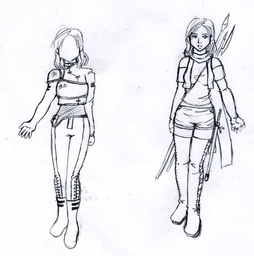
A wild Isolde appears, complete with combat accessories.
Notes: The left image is Isolde's military uniform (and the basic female design, though armor is added here). You can't see it too clearly, but her right arm is completely bare, as it traditional for the Imperial Military. The side-stripes are a dark blue and the rest of the uniform is white. The left sleeve has a patch cut out on the shoulder area where Isolde's tattoo is visible.

The top is shortened to allow the soldiers's skin to breathe in the tropical climate, but Isolde doesn't like exposing much flesh, so she wears a mesh holster under it and it extends over the pants. The pants are slit down the side from the knees down to allow soldiers' skin to breathe, but Isolde wears the laces tight and her boots over the slits.

On the right is her common Mercenary outfit, which doesn't conform to any uniform standards. There are some slits on the sides of the shorts and the entire length of the boots as her only concession to the heat of the Island climate. However, I imagine that her post as a mercenary is in a slightly cooler area of the temperate climate and might be able to get away with covering that much flesh.

The long scarf is actually made of a cheap light material and she often finds it useful to have some disposable lengths of cloth around to use for bedding or bandages.


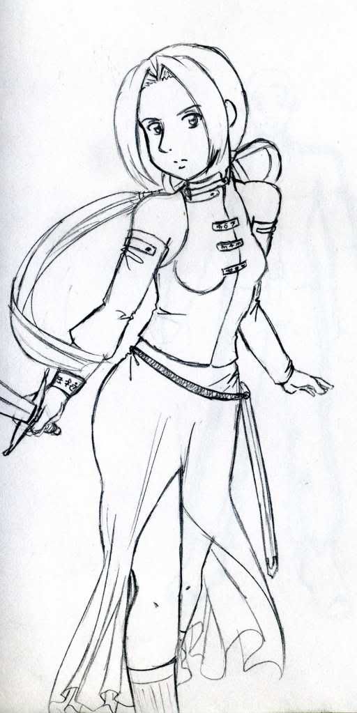
Katarine, looking spiffy.
Notes: She ties her long hair back with a ribbon, and I know that her hair shouldn't be moving like that in this pose, but I wanted to show off the ponytail.
Her mercenary outfit is meant to parallel Isolde's and Faulheit's a bit. The dress is slit half-way up the front and back to allow for freedom of movement, but it obscures her leg positions in battle, making it harder for her opponent to predict her moves. I was thinking her fighting style placed an emphasis on this kind of agile footwork.


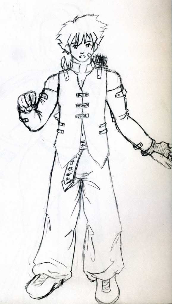
Faulheit, looking a bit emo.
Notes: He's supposed to look lazy and tired. But his outfit is designed to parallel Katarine's. They both added the same type of Flow-enhanced armor pieces to the front clasps of their shirts. All three of these mercenaries wear their detached sleeves a bit higher than the Academy students, since all three are former-Military and have to cover their double-stripe tattoos.
Faulheit's pants are loose and baggy to allow his skin to breathe in the island climate. His gloves are the kind used by archers that only cover the areas of the hands and fingers that are constantly drawing bowstrings to prevent cutting/slicing.


Now we know why Eirwen digs Mirek.
Notes: Yeah, Mirek is kinda buff. This doubles as the basic design of the Guardians' uniform.
My original plan when I envisioned it was that the Guardians of modern times descended from a much older sect of warriors, pre-Empire, that developed the techniques during the time of the First Practicioner. The group was all-male, of course, placing an extreme importance on strength (and a bit of vanity, with the 'ideal' Guardian being a soldier in perfect physical condition). Mirek is one of the few Guardians roaming around who so closely resembles the image of the 'ideal' Guardian, so he tends to attract a lot of attention among those interested in Guardians. After the rebellion, Mirek held onto the uniform out of both a lack of other clothing to wear and some of its practicality. The uniform features a large number of rune-encrusted Flow-enhanced armor pieces that are rather expensive to replace, and Mirek's only useful skills are battle-oriented, so he needs all the armor pieces he can get.

More on the basic uniform: When the original Guardians became a branch of the Empire's Military, their outfit was mildly altered to include the Imperial side-stripes and the cut-out patch where all Military members must display their double-stripe tattoo. The rebel Guardians have tended to repatch this opening, both in defiance of the Military and the cultural trend against completely covering one's arms.


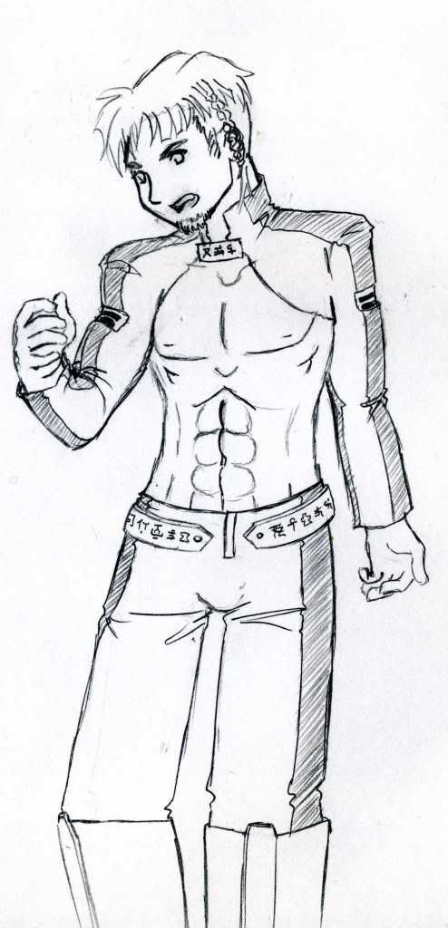
Military uniform base. Complete with missing sleeve to cover war injuries.
Notes: The male version reminiscent of Isolde's design above. The bared Right Arm developed as both a symbol of strength among soldiers, and also as a pragmatic compromise between uniform and tropical climate-wear.
The side-stripes and cutout patches are standards, and the pants are again slit from the knees-down to allow their skin to breathe. Shorter boots are also common in even hotter areas of the islands.
The outfit is a little plain to allow various adornments or armor to be worn on top of it.
This is also the basic design for Aurel.


Ilona. With 100% less full frontal then male Guardians.
Notes: When the Guardians were integrated, a tight-fitting black shirt was added to the female uniform to preserve feminine modesty.
Like all Guardians, Ilona has been growing a warrior's braid since she joined the force. In fact, she's dedicated enough to have not cut her hair (aside from her bangs) since she joined the group, potentially allowing her to use any strand of hair for her warrior braids.


Noemi, looking pretty.
Notes: Putting it all together here. It's a static pose to show off her outfit and hair. I could actually use this directly as an in-game portrait once I color it. Note that I'm striving to make sure all of the designs incorporate the Flow-enhanced (rune-inscribed) armor pieces throughout as a method of stylistically connecting the culture a bit. Noemi's feature on her ribbon and on the sides of her top, providing a bit of magical protection.

DjinnAndTonic

  • Genie and Potion with Alcoholic Undertones
  • DL
  • Denizen
  • *
  • Posts: 6938
  • "When you wish upon a bar~"
    • View Profile
    • RPGDL Wiki
Re: <Untitled IAQ Project> Aesthetics musings
« Reply #21 on: March 19, 2010, 06:20:25 AM »
I've been doodling all day and trying to envision the PCs in color, so here's some notes so I don't forget.

Imperial uniforms: Dark or Pale Blue side-stripes on an otherwise White uniform. Any time the double-stripe is used, it is a dark blue.

God-King attire: Primarily a crimson-red theme, though complementary whites, blacks, and earthtones can work here.

Mercenary outfits: Mostly earthtones and greens.

Haircolors in this world: I personally like using full technicolor rainbow anime hair, but I'm thinking it doesn't quite suit the tone of the game. However, being limited to REAL HAIRCOLORS ONLY WE'RE REALISTIC!!!!111one is a fast way to end up painting a game the color of dirt. As a compromise, I'm extending the dirt-palette out to include a few more rare/unnatural colors, but nixing the outlandish anime haircolors like neon green and Barney purple.
Acceptable hair-color choices: Black, Bluish Black, Dark Brown, Light Brown, Dark Blonde, Pale Blonde, Unnatural Silver, Grey, Strawberry Blonde, Orange (realistic Red), Unnatural Red, Auburn

Skin tones: Imperials are living on tropical islands, they are more dark-skinned and tanned, depending on the region/island.
God-Kings are from the more polar Southern region, they are predominantly pale-skinned.

Eye colors: Whatever. Personally voting full technicolor anime eye color here since no one pays much attention to eye color unless the story makes a big deal out of it.

Hair color distribution (because variety is key to having a cast that looks good together in a group picture)

Noemi: Pale Blonde
Erastus: Grey
Kasia: Light Rusty-Brown
Aurel: Black (tentative)
Shao: Light Brown
Fahim: Dark Blonde

Isolde: Bluish-Black
Katarine: Pale Blonde (tentative)
Faulheit: Dark Brown (Tentative)
Ilona: Orange (Natural Red, tentative)
Selena: Unnatural Silver

Mirek: Auburn
Eirwen: Black
Artur: Light Brown
Claire: Strawberry Blonde
Rafael: Unnatural Silver

Yiu: Dark Brown
Meilin: Unnatural Red
Xun: Dark Brown
Jin: Bald

Will try to narrow it down later. Just wanted to get my initial impressions out.

If anyone has any particulars they want for their character, speak now and I'll see if it works.
« Last Edit: March 19, 2010, 09:15:40 AM by DjinnAndTonic »

Dark Holy Elf

  • Moderator
  • Denizen
  • *
  • Posts: 8134
  • Well-behaved women seldom make history
    • View Profile
Re: <Untitled IAQ Project> Aesthetics musings
« Reply #22 on: March 19, 2010, 06:28:00 AM »
I always pictured Kasia as a sort of mousy brown, if that helps. Definitely shouldn't stand out.

Erwin Schrödinger will kill you like a cat in a box.
Maybe.

DjinnAndTonic

  • Genie and Potion with Alcoholic Undertones
  • DL
  • Denizen
  • *
  • Posts: 6938
  • "When you wish upon a bar~"
    • View Profile
    • RPGDL Wiki
Re: <Untitled IAQ Project> Aesthetics musings
« Reply #23 on: March 23, 2010, 06:17:48 PM »

Faulheit: Official Art
Getting to see Faulheit 'in action', so to speak. Nicer than the static shot from before. Really like how this turned out. You can even get an idea of how his Crossbow and Quiver attach to his outfit. Also... he strikes me as a bit of a drunk.


Noemi in motion part 2.
Now with clothes. I finished up this picture after getting a good look at the outfit from the last time.


Fa Xun: Design
First look at the God-Kings style. On your left, you can see the Shoulder Sash that proudly displays the God-Kings crest (or perhaps it's just Yiu's family's crest?). It's of a Lantern Wolf, because I like them. The Emblem is a black circle with a red silhouette of a stylized wolf overlaid.

Note that not an inch of Xun's skin, apart from his face, is visible. And he's got some fairly obvious armor pieces. His head-gear is a nod to his royalty, but it has the more practical function of being decent armor for deflecting glancing blows.

Hairstyle-wise, it's fashionable in the GK Tribes to have an asymmetrical cut. So yes, one half of Xun's hair is significantly longer than the other half.


Fa Xun & Bai the Lantern Wolf: Sketch
Just trying to get an idea of Xun in motion, really. The Lantern Wolf design here is a little bland. I basically just drew Blanca. So... at the moment, Lantern Wolves are literally just glow-in-the-dark regular-looking wolves. I need to liven up their design a bit. Any suggestions?


Ren Meilin: Face design
First look at Meilin. Going for a sleek look. Kept the asymmetrical hairstyle deal and matching half-circlet headgear. Not sure on clothing yet, but thinking skintight stuff. No skin showing, but still sexy and sleek.


Ren Yiu: First look
Got lazy while trying to design something for Yiu. I realized that I had no long-haired male characters. I'm personally not a fan of them, but they suit a fantasy setting, so I tried to come up with something I liked for Yiu. Note the shoulder sash w/ emblem is a constant. He has the same hair color as his brother.


Ren Yiu: King and Pirate sketches.
Trying to get a feel for Yiu as a Royal. That headpiece on the Left Yiu is the official royal crown of his family's tribe. He also gets a cape, because people like capes, and Yiu is dramatic enough to like them, I'd think. On the Right Yiu, we see him more relaxed, hair tied back, not every inch of skin covered (you can see his neck!), simplified functional headgear, Eyepatch! Well, okay, so Meilin made him take off the Eyepatch.


Noemi and Kasia: Official Art
Action poses! I really like the way these two balance a picture together. They're similar, but they're just different enough to contrast. I think this will look nice colored. This is probably my most 'Official' piece of art to date? I hadn't intended it when I sat down to doodle, but I really got into it.

AndrewRogue

  • Infinite
  • DL
  • Denizen
  • *
  • Posts: 3079
  • Sadness
    • View Profile
Re: <Untitled IAQ Project> Aesthetics musings
« Reply #24 on: March 24, 2010, 06:43:12 AM »
Faulheit: Like that piece quite well. Looks less emo, more styling. Good all around.

Noemi: Looks good. Those little ties still bug me, but the design is still sound.

Xun: The rough initial design looks pretty rocking and I think the overall style works.

Xun and the Puppy: Build off the name. Give the wolf some globular structures suspended around the fur to focus in on the name. Possibly almost antenna like. Probably a few, long, fiber optic like structure running down their side.

Meilin: Face looks right on to NEB's descriptions. Like the circlet and hair.

Yius: Not overly sure yet.

Noemi and Kasia: Good action shot. Looks like a promo piece indeed.