Author Topic: An Aesthetic Discussion Spanning 17 Years - Andrew vs Pokemon - DAILY UPDATES!  (Read 39350 times)

AndrewRogue

  • Infinite
  • DL
  • Denizen
  • *
  • Posts: 3079
  • Sadness
    • View Profile
Re: An Aesthetic Discussion Spanning 17 Years - Andrew versus Pokemon
« Reply #125 on: December 28, 2015, 02:56:51 AM »
Koffing: He looks like a toxic sac of gas. The ports give the design some good texture and the skull and crossbones is pretty rad. That totally satisfied face makes the design work though. He's all "I know I'm foul, what're you gonna do about it?" I should tally how many goddamn purple pokemon there are. Still, he's good! 4/5

Weezing: Eh. As far as a merged design goes, it looks pretty decent, but the more dour, thicker lips and eyebrows don't really do it for me. I feel like I should like this design more and credit it better, but biased Andrew is biased. Weezing is just too dour. 3/5

Rhyhorn: Rock rhino is pretty rad. Lotta detail that makes it look way cooler than it's RL counterpoint and to give it that inorganic feel. The triceratops frill too. This thing looks like it'll murder you if you run into it. I will say, the big open flat, undetailed space that is it's ass is hella weird looking though. Seriously, check out the Gen 5 sprite. I feel like the shell should come down over that instead of giving us an upskirt shot. 4/5

Rhydon: And they ruined it. We're gonna take your rocky design and... shed most of it to make you a bipedal whatever. Seriously, this design is a weird corss-section of pokemon things I hate. Random biped for a quadraped. Segmentation in dumb places. Stupid, off-color horn with unnecessary spiral. And I didn't notice this until I looked at it, but why does it have like three different face frills? It honestly doesn't even look like a rock type! 1/5

Chansey: I... have honestly never known what to make of Chansey. Like, seriously, what is this thing? The design... is there, I guess? It's distinct from Jiggly and Clefairy, which is impressive, considering how little it has. The hair tentacles are there, and so's the tail, which are nice touches. The egg is weird and the stubby arms and feet are nothing. You got me. I feel I should hate this more, but maybe Gen 1 bias is in full effect? Because it doesn't really bother me. 3/5

Tangela: Why are you blue? Why do you have stupid red shoes? I feel this design would be improved if it were basically just natural, leafy vines with some eyes peering out. Possibly less derp looking eyes. As is, this is the 1/5 I forget exists all the time.

Kangaskhan: Rad, if a little weird when you actually look at it. No stupid segmentation on the different colored underbelly! Rad dinosaur build, with a few weird little... plate things that I don't really understand on it. The back spines give it more texture. Black headplate works, but those horn things are... odd. Three totally different colors all clumped together bug me. Oh, and having a rad, adorable baby version of it around in it's pouch is awesome. Good shape overall, but some really weird detail choices. Still, enough to earn 4/5

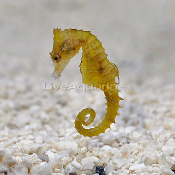
Horsea: You know, I thought I liked this design, but it turns out I don't. Dunno what it is. Underdesigned, maybe? Stupid goddamn belly segments? The face spikes are a nice touch, but yeah, Horsea just looks too much like a cartoon seahorse, I guess? The bug wing fins are kinda stupid too. 2/5

Seadra: Well, I like it more than Horsea? The tail curling to the side of the body like that looks weird. I think it would have been better if it were more S shaped, with an added curl at the bottom of the S. The "wings" are cool fins. Looking at it, I think something that bugs me about both this and it's preevo are that their heads are basically balls with tubes on them, while actual seahorses have more of snouts. I think that would have improved both designs a lot. Also, Seadra's art is angled weird. Whatever. 3/5

Goldeen: Let's get the good out of the way. Goldeen's fins are rad, as is the coloration. And we're done. Horn looks glued on, lips are stupid, eyelids are stupid, and first you draw a bean then you're done drawing Goldeen's stupidly shaped body. Seriously though, that tail fin is AWESOME. Unfortunately, it is attached to an otherwise terrible design. 2/5

Seaking: Fuck yeah! Also rad fins, also rad colors, also stupid goddamn stupid lips and glued on horn. Look, I get nature glues bits on animals sometimes, but when you have such sick colors, you should take adcantage of them. Also maybe not always make every horn just a sharp cone. A firm improvement on Goldeen, though, and one I like a lot more than I expected. And yes, arbitrarily round is better fish shape than Goldeen. Those lips though. 3/5

Staryu: Did you know Staryu's gem thing is only attached via a single wraparound on one of it's lower left arm? I didn't. That's actually a really neat touch. Staryu is way cooler than it should be. The simple combination of starfish plus odd looking amulet is just nice looking. This is what simple designs should look like. 4/5

Starmie: Pretty awesome evo, too. The second starburst behind it and the improved gem are solid improvements. This is a displayed art thing, but I don't like the way it's "main" arms are drooping, but I think that's a non-neutral pose. Colorshift is good and, hey, it's more of a blue than a purple, so that's cool, right? 4/5.

Boy am I hype right now! I'll probably do some more after dinner! I hope they're all awesome looking!

AndrewRogue

  • Infinite
  • DL
  • Denizen
  • *
  • Posts: 3079
  • Sadness
    • View Profile
Re: An Aesthetic Discussion Spanning 17 Years - Andrew versus Pokemon
« Reply #126 on: December 28, 2015, 08:55:52 AM »
Mr. Mime: 1/5, only because I'm not using 0 on this scale. Nothing redeeming about this design at all. Why do you have suction cup fingers? Why the pink balls? Why the stupid hair and differently colored joints on your knees? What the fuck is your problem?

Scyther: I want to like Scyther more than I do, but the actual bug body kinda creeps me out. Like, non-existent waist into fat thorax thing that has segments. Everything else about the design is cool though. Scythe-arm dragon dinosaur. 13 year old me is still hype. Just make it black and red! Seriously though, 4/5 despite freaking me out whenever I actually pay attention to it.

Jynx: No. 1/5.

Electabuzz: Why do they clump stupid designs next to each other? The coat is pretty awesome (it conveys electricity well) but that's sort of the end of it. Sorta dumb, shapeless body with chocobo frills and robot antennae. Why? I'd kinda think it's trying to be an electric ape, but then it has a goddamn cat tail and prominent canines so what the fuck do I know? Still, you aren't Jynx or Mr. Mime I guess. 2/5

Magmar: Dear sir, you have a butt for a head and a duckbill. Also, you're fat. 1/5

Pinsir: Oh thank Arceus, something not completely terrible. This design is really all about those horns, and they are awesome. That thing will pince you to DEATH. Everything else is kinda meh? Like, why do you only have a lump for a body and spindly arms? But honestly, those pincers are worth a lot. 3/5

Tauros: I kinda think the fact that I'm giving Tauros a decent score says a lot about my taste, for better or worst. Just a competent bull redesign. Triple tails, mane, and metallic horns and head thingies that I don't understand but like. It works well. 4/5

Magikarp: Why do all fish in Gen 1 have lips? But better design than Goldeen overall, though. Fish shape. Colors are nice. Whiskers are a neat touch. The eyes tell you everything you need to know about this fish. 4/5

Gyarados: Give this fucker a real carnivore snout and he'd be an easy 5. Lotta nice details all across this one. Like, that entire body is perfect sea serpent. Just stellar. Except for that stupid mouth that will never close. 4/5

Lapras: See, your horn doesn't have to look stupid and glued on. Plesiosaurs already look pretty nice, and adding a spiny shell onto one is a really nifty idea for an alteration. The color is pleasant and the little mottled spots as well as different colored underbelly provide interest to the boring parts of the body. The curly ears are a bit weird though. 5/5

Ditto: I am not sure how to score Ditto since the point is an amorphous blob that becomes anything. Looks better than Grimer but worse than Muk? But it's also purple because purple. Seriously, someone tell me: how many fucking purple pokemon have I reviewed so far? Too many. Also his face is dumb. Whatever. 2/5 for wasting my time.
« Last Edit: December 31, 2015, 09:16:35 PM by AndrewRogue »

Grefter

  • Villain.
  • DL
  • Denizen
  • *
  • Posts: 10386
  • True and Honest. Smarter. More aggressive.
    • View Profile
Re: An Aesthetic Discussion Spanning 17 Years - Andrew versus Pokemon
« Reply #127 on: December 28, 2015, 09:20:16 AM »
Mr Mime doesn't have weird knee joints.  Those are knee pads for how much he fucking sucks.
NO MORE POKEMON - Meeplelard.
The king perfect of the DL is and always will be Excal. - Superaielman
Don't worry, just jam it in anyway. - SirAlex
Gravellers are like, G-Unit - Trancey.

Excal

  • Chibi Terror That Flaps in the Night
  • DL
  • Denizen
  • *
  • Posts: 2603
  • Let's Get Adorable
    • View Profile
Re: An Aesthetic Discussion Spanning 17 Years - Andrew versus Pokemon
« Reply #128 on: December 28, 2015, 10:04:33 AM »
Just gonna say.  They live, and they're trying to escape.


Cotigo

  • Jerkface
  • Denizen
  • *
  • Posts: 4176
  • Yoo-hoo, Mr. Tentacle Guy...
    • View Profile
Re: An Aesthetic Discussion Spanning 17 Years - Andrew versus Pokemon
« Reply #129 on: December 28, 2015, 11:37:09 AM »
1. Staryu's gem is also clearly attached through its legs and may be attacked above it's shoulders, hard to say from that angle.

2. Seriously, you spend the last 100 some pokemon bitching about unnecessary segmentation and then give Gary.DOS a 4/5 without commenting on the segmentation at all? #k

3. Lapras best Gen 1 Pokemon agree or be incorrect.

Captain K

  • Ugly Old Man
  • Denizen
  • *
  • Posts: 1203
  • Saving the world with curry and coffee
    • View Profile
Re: An Aesthetic Discussion Spanning 17 Years - Andrew versus Pokemon
« Reply #130 on: December 28, 2015, 04:23:29 PM »
3. Lapras best Gen 1 Pokemon agree or be incorrect.

Agree.


Fun fact:  Rhydon was the first pokemon designed.  So yeah it's gonna suck.

Grefter

  • Villain.
  • DL
  • Denizen
  • *
  • Posts: 10386
  • True and Honest. Smarter. More aggressive.
    • View Profile
Re: An Aesthetic Discussion Spanning 17 Years - Andrew versus Pokemon
« Reply #131 on: December 28, 2015, 09:20:14 PM »
Also can we review Kangaskhan and how fucking shitty it is actually?  Since we are going to call out every time stuff is segmented and you love it Andy.  That isn't how pouches work.  If you are going to reference Kangaroo's at least get the basic anatomy correct.


The pouch is not an extra bit bolted on the front. 
NO MORE POKEMON - Meeplelard.
The king perfect of the DL is and always will be Excal. - Superaielman
Don't worry, just jam it in anyway. - SirAlex
Gravellers are like, G-Unit - Trancey.

DjinnAndTonic

  • Genie and Potion with Alcoholic Undertones
  • DL
  • Denizen
  • *
  • Posts: 6938
  • "When you wish upon a bar~"
    • View Profile
    • RPGDL Wiki
Re: An Aesthetic Discussion Spanning 17 Years - Andrew versus Pokemon
« Reply #132 on: December 29, 2015, 02:16:43 AM »
Quote
How many purple?!

21 to 24, depending on if you're counting things like Jynx, Machamp, and Butterfree, which aren't technically classed as Purple.

Starmie is rad and I just wanted to point that out. Lapras is also quite possibly the best design in Gen 1. Arcanine is my favorite but Lapras is awesome without any bias for it.

I'm also really glad that Electabuzz and Magmar aren't rated highly here because I see a surprising number of fans for them and it just boggles my mind.

On Chansey, I think the general theme is Egg, considering the overall shape. It's a solid design and I think you gave it the right rating but part of it is that it does the whole Egg themed Pokemon thing better than Exeggcute. (Though not nearly as well as Togepi that thing is stupid cute.) Chansey's evolutions are also a lot less stupid looking than say Jigglypuff's.

Cotigo

  • Jerkface
  • Denizen
  • *
  • Posts: 4176
  • Yoo-hoo, Mr. Tentacle Guy...
    • View Profile
Re: An Aesthetic Discussion Spanning 17 Years - Andrew versus Pokemon
« Reply #133 on: December 29, 2015, 05:20:12 AM »
Magmar is great because he is a Butt Billed Playipus


Grefter

  • Villain.
  • DL
  • Denizen
  • *
  • Posts: 10386
  • True and Honest. Smarter. More aggressive.
    • View Profile
Re: An Aesthetic Discussion Spanning 17 Years - Andrew versus Pokemon
« Reply #134 on: December 29, 2015, 08:28:26 AM »
My favourite typing is Garbage Fire Pokemon.
NO MORE POKEMON - Meeplelard.
The king perfect of the DL is and always will be Excal. - Superaielman
Don't worry, just jam it in anyway. - SirAlex
Gravellers are like, G-Unit - Trancey.

Cotigo

  • Jerkface
  • Denizen
  • *
  • Posts: 4176
  • Yoo-hoo, Mr. Tentacle Guy...
    • View Profile

Grefter

  • Villain.
  • DL
  • Denizen
  • *
  • Posts: 10386
  • True and Honest. Smarter. More aggressive.
    • View Profile
Re: An Aesthetic Discussion Spanning 17 Years - Andrew versus Pokemon
« Reply #136 on: December 29, 2015, 10:12:10 PM »
Well yeah.
NO MORE POKEMON - Meeplelard.
The king perfect of the DL is and always will be Excal. - Superaielman
Don't worry, just jam it in anyway. - SirAlex
Gravellers are like, G-Unit - Trancey.

AndrewRogue

  • Infinite
  • DL
  • Denizen
  • *
  • Posts: 3079
  • Sadness
    • View Profile
Re: An Aesthetic Discussion Spanning 17 Years - Andrew versus Pokemon
« Reply #137 on: December 31, 2015, 09:33:31 PM »
I have decided that Lapras gets the distinct honor of being the first pokemon to receive a score change after posting. Congrats!

Also, re: Staryu:

That said, I said I'd finish Gen 1 before the new year, so here we go! I'll do some neat aggregrate stat stuff after I finish the Gen.

Eevee: Eevee's head is too boxy. Like, way too boxy. Which is a shame, because it's body is great. Floofy mane (that nicely contrasts the body), that adorable foxy tail (with the white tip), and a great toy canine body. Give it a bit more of a canine/vulpine/feline face and it'd be pretty close to a five, but as is... I'll go with a slightly generous 4/5 given the sprites address the head issue by making it smaller than the official art.

Vaporeon: Second best eeveelution. Pretty much what you'd expect out of a water dog. Nice coloration (the two blues and accented yellow on the ears work really well). The "mane" is probably the oddest bit of the design, but it's a nice holdover from eevee (all of the first three evolutions have one!). The back ridge looks fantastic, as does the fish tail. 5/5

Jolteon: Worst eeveelution. Not that this is the worst crime or naything. Eevee line on the whole looks great. The spikey look just doesn't work for me. You'd lose an eye hugging jolts. Plus those weird lightning butt-wings are weird. 3/5

Flareon: Best eeveelution. Adorable as fuck. 6/5

Porygon: Neat concept, but I'm not overly fond of it in practice. 3/5

Omanyte: Unexpectedly adorable. Nautiluses are pretty adorable to begin with, but those massive googly eyes and tiny tentacles make this pokemon work. Sugmori needed a few more colored pencils in his box, though. 4/5

Omastar: From cute to kinda terrifying, and not in a particularly good way. Basically just too much effort into making him scarier. The slit eyes and beak think in particularly just don't work for me, but the transition to two giant tendrils and a bunch of noodly ones isn't too great either. 2/5

Kabuto: Less cute than I remember. The divots on top of his shell are weird, as is the concentration on his underbody. Black void is generally uninteresting for body, his eyes are focused directly on the ground, and I have no idea how those little claw feet work. The focus should have been on top of the shell. 3/5

Kabutops: Also worse than I remember. The idea is kind of neat, but it doesn't work in practice for me. Why a random bipedal horseshoe crab? I feel like the Omastar approach would have worked better here: expand Kabuto's design into something bigger and meaner. 2/5

Aerodactyl: Didn't get copy pasted into the post somehow. I should like Aerodactyl less, what with his really odd proprotions and that goofy ass underbite, but the design generally works for me. This is what a ferocious dinosaur pokemon should look like! 3/5

Snorlax: Your mom. 3/5

Articuno: Best of the legendary birds. That tail and crest are amazing, as is the chest tuft. 4/5

Zapdos: Same problem as Jolteon, really: I don't like the spikey look. Jolteon wore it a little better though, since his head didn't look half as stupid. Also, why does he had brown leg tufts? 2/5

Moltres: Fairly standard phoenix design. Not the best, not the worst. 3/5

Dratini: Sorta cute sea serpent thing. The white snout makes for a dumb looking nose, though. 3/5

Dragonair: And it becomes something really beautiful. The blue and white remains nice, the little beads on the tail and neck are nice affectations, the snout is a great shape, and, surprisingly, I really like the ear wings. 5/5

Dragonite: And it becomes this. I'm pretty harsh on Dragonite for being a stupid looking puff the magic dragon thing, which is kinda unfair. I mean, it's an okay design overall (I wonder why he's yellow, though)! But after Dragonair, I was expecting something beautiful, not this chump. So, basically, fuck Dragonite even if his design is technically not terribleish. 2/5

Mewtwo: Well, he looks like a terrifying genetic abomination. So, props on succeeding, I suppose? Kinda blends alien, animal, and humanoid elements pretty well. Not sure what the neck tube is. The pecs are a bit weird but nicely give a little more design to the otherwise plain upper body. I thought I hated him, but you know, all told, it succeeds well at what it was trying to do. 3/5

Mew: Super adorable. 5/5

Happy New Year.
« Last Edit: January 02, 2016, 08:39:54 AM by AndrewRogue »

Grefter

  • Villain.
  • DL
  • Denizen
  • *
  • Posts: 10386
  • True and Honest. Smarter. More aggressive.
    • View Profile
Re: An Aesthetic Discussion Spanning 17 Years - Andrew versus Pokemon
« Reply #138 on: December 31, 2015, 10:08:04 PM »
Give it a bit more of a canine/vulpine/feline face and it'd be pretty close to a five

Then proceed to give the one with a proper muzzle 3/5.

Fucking biased agenda.
NO MORE POKEMON - Meeplelard.
The king perfect of the DL is and always will be Excal. - Superaielman
Don't worry, just jam it in anyway. - SirAlex
Gravellers are like, G-Unit - Trancey.

Dark Holy Elf

  • DL
  • Denizen
  • *
  • Posts: 8134
  • Well-behaved women seldom make history
    • View Profile
Re: An Aesthetic Discussion Spanning 17 Years - Andrew versus Pokemon
« Reply #139 on: January 01, 2016, 04:49:27 AM »
This thread has earned my approval for hype of Starmie and Articuno.

Enough that I'm totally willing to ignore hype for Mew.

Erwin Schrödinger will kill you like a cat in a box.
Maybe.

DjinnAndTonic

  • Genie and Potion with Alcoholic Undertones
  • DL
  • Denizen
  • *
  • Posts: 6938
  • "When you wish upon a bar~"
    • View Profile
    • RPGDL Wiki
Re: An Aesthetic Discussion Spanning 17 Years - Andrew versus Pokemon
« Reply #140 on: January 02, 2016, 01:27:57 PM »
Articuno needs 5/5.

Also Kabutops is pretty badass, and unlike the gen 5 robo redesign, his design really looks like a natural organic creature. Feels like something out of half life, which is a sweet direction to take a Pokemon design.

AndrewRogue

  • Infinite
  • DL
  • Denizen
  • *
  • Posts: 3079
  • Sadness
    • View Profile
Re: An Aesthetic Discussion Spanning 17 Years - Andrew versus Pokemon
« Reply #141 on: February 04, 2016, 06:26:20 PM »
Gen 2 starts this week.

Brace yourselves. Pokemon are coming.

DjinnAndTonic

  • Genie and Potion with Alcoholic Undertones
  • DL
  • Denizen
  • *
  • Posts: 6938
  • "When you wish upon a bar~"
    • View Profile
    • RPGDL Wiki
Re: An Aesthetic Discussion Spanning 17 Years - Andrew versus Pokemon
« Reply #142 on: February 04, 2016, 11:59:10 PM »
My body is ready. And my pokeballs.

Grefter

  • Villain.
  • DL
  • Denizen
  • *
  • Posts: 10386
  • True and Honest. Smarter. More aggressive.
    • View Profile
Re: An Aesthetic Discussion Spanning 17 Years - Andrew versus Pokemon
« Reply #143 on: February 05, 2016, 12:03:43 AM »
This one will be easy, you just do it in one post.

Gen 2 in its entirety - 0/10 fuck off forever

Then move on to Gen 3.
NO MORE POKEMON - Meeplelard.
The king perfect of the DL is and always will be Excal. - Superaielman
Don't worry, just jam it in anyway. - SirAlex
Gravellers are like, G-Unit - Trancey.

AndrewRogue

  • Infinite
  • DL
  • Denizen
  • *
  • Posts: 3079
  • Sadness
    • View Profile
Re: An Aesthetic Discussion Spanning 17 Years - Andrew versus Pokemon
« Reply #144 on: February 05, 2016, 12:42:37 AM »
Oh, and in case anyone was interested...

https://docs.google.com/spreadsheets/d/1xZnLaow2wwWum9UwQDtOO19WFpYx_xcwmOKd8UExO_A/edit?usp=sharing

All the current stats organized into a nice little doc. Includes types for eventual sorting and averaging shenanigans.

If anyone was curious, I apparently understand how to rate, considering Gen 1 came out with an average score of 3.09.

Grefter

  • Villain.
  • DL
  • Denizen
  • *
  • Posts: 10386
  • True and Honest. Smarter. More aggressive.
    • View Profile
Re: An Aesthetic Discussion Spanning 17 Years - Andrew versus Pokemon
« Reply #145 on: February 05, 2016, 01:01:30 AM »
If anyone was curious, I apparently understand how to rate, considering Gen 1 came out with an average score of 3.09.

I think the data actually shows you know how to be average given how many times you are objectively wrong about pokemon design.
NO MORE POKEMON - Meeplelard.
The king perfect of the DL is and always will be Excal. - Superaielman
Don't worry, just jam it in anyway. - SirAlex
Gravellers are like, G-Unit - Trancey.

Excal

  • Chibi Terror That Flaps in the Night
  • DL
  • Denizen
  • *
  • Posts: 2603
  • Let's Get Adorable
    • View Profile
Re: An Aesthetic Discussion Spanning 17 Years - Andrew versus Pokemon
« Reply #146 on: February 05, 2016, 08:44:05 AM »
This one will be easy, you just do it in one post.

Gen 2 in its entirety - 0/10 fuck off forever

Then move on to Gen 3.

You just called Houndour 0/10.

I am sorry Grefter, but we must be enemies now.

Grefter

  • Villain.
  • DL
  • Denizen
  • *
  • Posts: 10386
  • True and Honest. Smarter. More aggressive.
    • View Profile
Re: An Aesthetic Discussion Spanning 17 Years - Andrew versus Pokemon
« Reply #147 on: February 05, 2016, 10:48:08 AM »


NO MORE POKEMON - Meeplelard.
The king perfect of the DL is and always will be Excal. - Superaielman
Don't worry, just jam it in anyway. - SirAlex
Gravellers are like, G-Unit - Trancey.

DjinnAndTonic

  • Genie and Potion with Alcoholic Undertones
  • DL
  • Denizen
  • *
  • Posts: 6938
  • "When you wish upon a bar~"
    • View Profile
    • RPGDL Wiki
Re: An Aesthetic Discussion Spanning 17 Years - Andrew versus Pokemon
« Reply #148 on: February 05, 2016, 11:10:15 AM »
Yeah, I kinda agree. I don't think -any- generation of Pokemon is entirely worthless. Gen 2 has Houndour, Suicune, Lugia at the very minimum for objectively good designs.

Hunter Sopko

  • Heavily in Debt
  • DL
  • Denizen
  • *
  • Posts: 4556
  • Hai, Kazuma-desu
    • View Profile
Re: An Aesthetic Discussion Spanning 17 Years - Andrew versus Pokemon
« Reply #149 on: February 05, 2016, 11:45:17 AM »
I would've thought you'd be a fan of Dunsparce's buttplug inspired design, Grefbro. Guess you can never really know people.

Also, no love for the 6 ANLFSTs of Ladyba?